This post may contain affiliate links. If you use these links to buy something we may earn a commission at no extra cost to you. Thank you for your support!
Anyone who loves making lovely designs, small business owners, or uses social media has likely already found Canva’s versatility. Whether you’re designing a book cover, wedding invitation, or Instagram post, choosing the right font choices can be a game changer. When I initially tried Canva, I was astounded by how intuitive the design process seemed, especially with the abundance of available free fonts and tools.
When I perfected the perfect Canva font pairings, my designs reached a whole new level. Whether you’re aiming for a bold font for a headline or a subtle paragraph font for body text, finding the right balance is key.
As a designer myself, font pairings are extremely important so the text and the design work together instead of overwhelming each other. I learned my first pairings from the Canva Font Pairing article a few years back, which remains a constant source of Canva font inspiration for many designers.
A well-executed font pairing may do wonders for attracting viewers and establishing the mood of your writing. With the best fonts at your fingertips, your design might take a step up notch, appearing more polished and coherent.
Why the Right Font Choices are a Game Changer – In More Ways Than One
When you consider the role that modern fonts and elegant script fonts play in creating beautiful designs, it’s clear how important font pairing is.
For example, you wouldn’t use a script font for a highly technical document, just as you wouldn’t use a bold font for soft, elegant wedding invitations. Choosing the perfect fonts that align with your design’s aesthetic can significantly influence the perception of your work.
If you are using Canva for any kind of design—wedding invitations, social media posts, marketing materials—you’re in for a treat!
I am going to walk you through Canva font guides and how to employ font pairings to make beautiful graphics.
You might be interested in: Best Canvas Size for Instagram Digital Art: A Comprehensive Guide
15 Best Canva Font Pairings Ideas
Combining your different favorite Canva fonts is a great approach to making your designs more visually appealing and balanced and giving them a unique style.
Have a look at Canva by clicking here: Get your Canva Pro Plan Now
Keeping in mind there is also a free Version of Canva available, so you can hop in and check out the tons of fonts you can use.
1. Playfair Display & Montserrat
Combining a modern Sans-Serif typeface with a classic serif font achieves a great pair of classy and modern vibe.
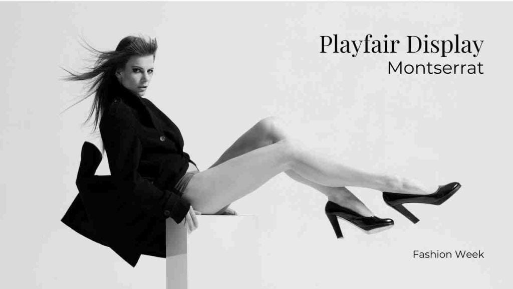
Ideal Use: Elegant invitations, fashion, and lifestyle branding.
2. Raleway & Open Sans
The perfect combination of form and function that is simple, clean, and minimalistic.
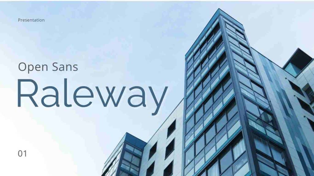
Ideal Use: Corporate presentations, professional portfolios.
3. Pacifico & Roboto
Combining a mild sans-serif (Roboto) and a playful script (Pacifico) makes for a lively and engaging design.
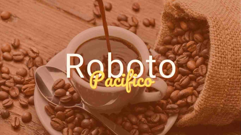
Ideal Use: Fun, casual branding for small businesses or creative projects.
4. Lora & Poppins
Lora gives timeless elegance while Poppins adds a modern style; the two fonts are a combination of contemporary and classic style.

Ideal Use: Blogs, magazines, and editorial content.
5. Dancing Script & Lato
A vibrant and well-balanced vibe is achieved by pairing an expressive script font with a grounded sans-serif.
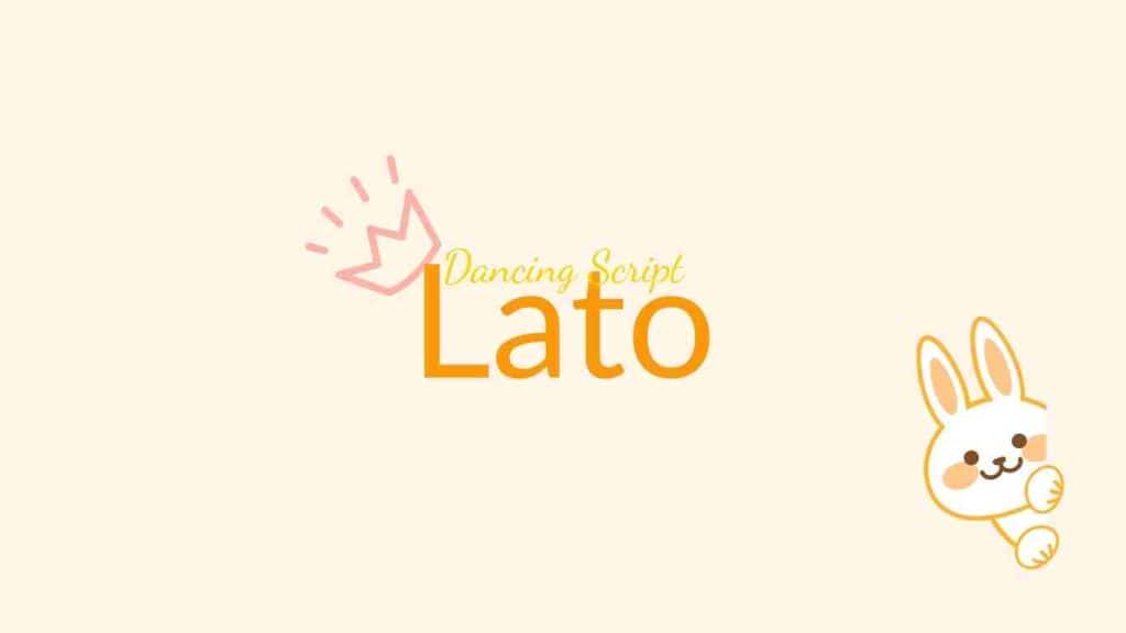
Ideal Use: Event promotions, social media graphics, or personal branding.
6. Josefin Sans & Abril Fatface
A bold, high-contrast display serif (Abril Fatface) and a geometric sans-serif (Josefin Sans) work together to make a stylish and modern look.
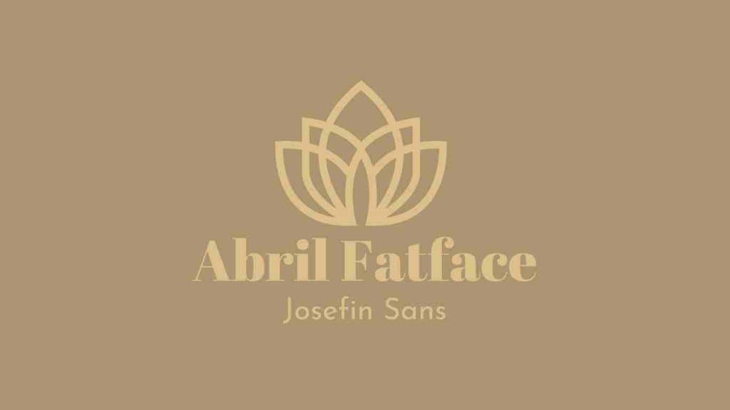
Ideal Use: Fashion magazines, luxury brands, or editorial layouts.
7. Bebas Neue & Open Sans
While Open Sans is neutral and easy to read on its own, Bebas Neue, a bold and condensed sans-serif, goes well with it.
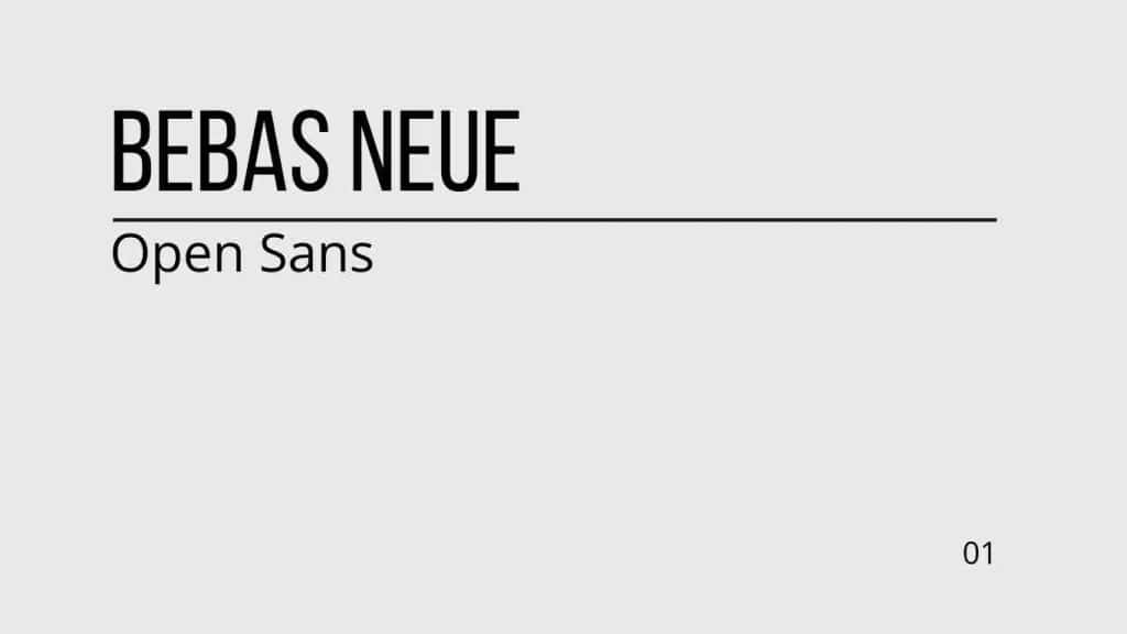
Ideal Use: Event posters, banners, heading font, and bold headlines with clear, easy-to-read body text.
8. Merriweather & Oswald
Oswald is a compact sans-serif font that looks great in headers, while Merriweather is a classic serif font that looks great in body text.

Ideal Use: Blogs, long-form content, educational presentations, or articles with lots of text.
9. League Spartan & Libre Baskerville
A modern and bold sans-serif font is League Spartan, and a classic but elegant serif font is Libre Baskerville.

Ideal Use: Digital marketing materials, startup presentations, or tech-focused designs.
10. Montserrat & Cardo
Cardo, a stylish sans-serif font, adds a touch of culture, while Montserrat gives you a clean and modern sans-serif look.

Ideal Use: Websites, portfolios, and professional branding materials (for social media marketers) where modernity and tradition meet.
11. Poppins & Georgia
Poppins is a flexible sans-serif font with rounded edges that goes well with Georgia, a reliable serif font that is known for being easy to read on screens.

Ideal Use: Business presentations, social media posts, and corporate designs.
12. Anton & Lora
Anton is a modern, bold sans-serif font for catchy headlines. Lora, on the other hand, is a balanced serif font that gives body text an elegant look.

Ideal Use: Marketing posters, promotional graphics, or lifestyle blogs (for content creator).
13. Rokkitt & Lato
As a pair, Rokkitt and Lato—a clean and flexible sans-serif- can give the impression of being new as well as vintage and having a strong presence.

Ideal Use: Minimalist websites, professional designs, personal branding, or travel blogs.
14. Amatic SC & Barlow
Barlow is an organized, simple sans-serif that is ideal for body text, while Amatic SC is a quirky, handwritten style that works well for headlines.
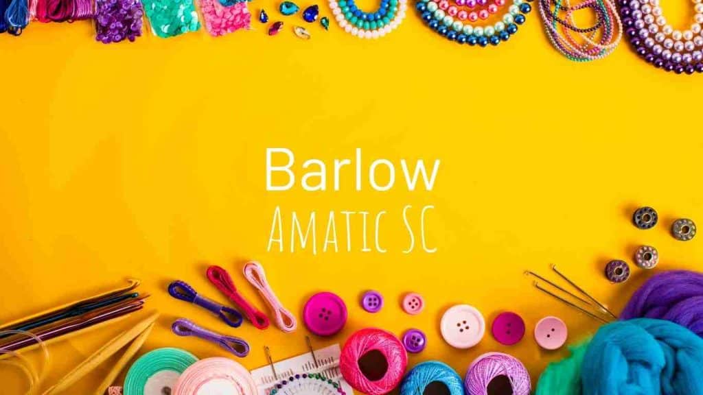
Ideal Use: Creative designs, craft businesses, or personal projects with a playful tone.
15. Helvetica World & Garamond
Helvetica World is a classic sans-serif font that is known for being neutral, and Garamond is a classic serif font that has a timeless look.
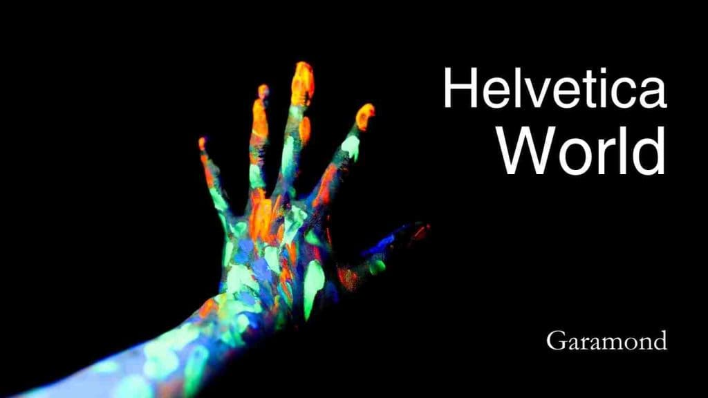
Ideal Use: High-end branding, professional designs, geometric shapes, editorial designs, and art-focused projects where balance and tradition are key.
Types of Typography
Before you can pair fonts like a pro, it is important to know about various types of typography. When you use different fonts in your design, they can all give it a different look and feel. Here are some of the best Canva fonts I really like and use frequently across all my designs:
Serif Fonts
Serif fonts have little strokes, or “feet,” at the ends of the letters. They make you look professional and are great for a more formal or traditional look. Times New Roman, Georgia, Garamond, and Merriweather are all well-known examples.
Sans-Serif Fonts
Fonts that are sans-serif do not have the little clean lines at the ends, which makes them look trendy and clean. They are easy to read, especially on computers, and many artists, including me, use them all the time. Some well-known examples are Open Sans, Helvetica, Montserrat, and Arial.
My personal faves? The Plus Jakarta Sans and Inter. (Heart! Heart! Heart!)
Script Fonts
Anywhere from elegant font to casual, script styles look like handwriting or cursive fonts. You should only use a few of them to avoid losing your content. They add a personal or fun touch to your designs. The most popular fonts are Allura, Pacifico, Dancing Script, and Great Vibes.
Decorative/Display Fonts
The point of decorative fonts is to draw attention to them, so their styles are often over the top. They look great for bold headlines or special themes, but do not use too many of them—less is more with these fonts. As examples, Lobster, Bebas Neue, Playfair Display, and Abril Fatface come to mind.
Slab Serif Fonts
The point of decorative fonts is to draw attention to them, so their styles are often over the top. They look great for bold headlines or special themes, but do not use too many of them—less is more with these fonts. Some of the examples are Rokkitt, Rockwell, Courier, Museo Slab.
Monospace Fonts
In monospace fonts, each letter takes up the same amount of space. This makes the fonts look structured and uniform. Most of the time, these are used for coding or making retro patterns. Examples include Courier, Space Mono, IBM Plex Mono, and Roboto Mono.
Handwriting Fonts
Handwriting styles make you think of a personal, casual style. These are great when you want to add a real touch to social media posts or your personal brand. Some well-known examples are Amatic SC, Indie Flower, Satisfy, and Sacramento.
You might be interested in: Canva Elements: The Ultimate Guide To Designing Stunning Graphics
Utilizing Canva’s Library of Font Pair
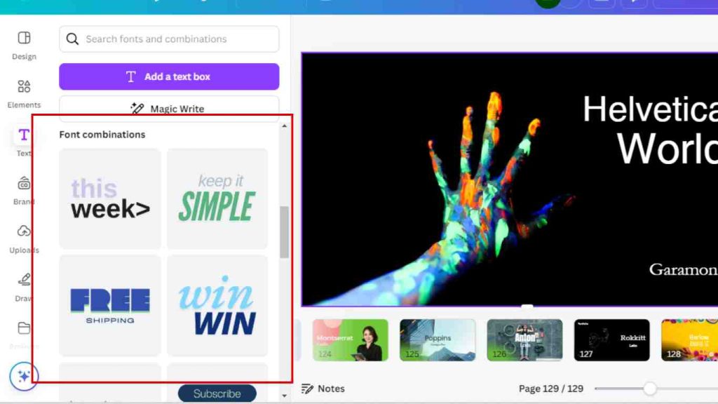
Canva makes it simple to try out different font combinations. Canva’s provided font pairing ideas are great if you have ever been unsure of which fonts go well with each other. You can see a sample of how they will look together, change the sizes and weights, and adjust the spacing to get the look you want.
You might be interested in: Hourly Rate For A Freelance Graphic Designer: How To Charge Correctly
Using Google Fonts and Custom Font Choices for Unique Designs
If you’re using Canva for commercial use or want a highly tailored design, consider exploring Google Fonts and uploading your own custom fonts.
Canva makes it easy to integrate these extra fonts, expanding your creative options even further. If you find yourself looking for a more personalized touch, try mixing favorite fonts from Google with Canva’s built-in library to achieve the ultimate balance in your projects.
Pairing Script Fonts and Body Fonts
When working on social media posts, marketing materials, or even for interior designers who want to present a refined brand image, consider mixing an elegant script font for the headers and a clean, readable body font for the text.
For instance, pairing script fonts like Dancing Script with a neutral sans-serif like Lato can add both vibrancy and professionalism to your designs.
Font Pairing Tips for Mobile Devices and Commercial Use
With many designs now viewed on mobile devices, it’s critical to choose a clean font that reads well on smaller screens.
Always keep the font size and spacing in mind, ensuring readability for your target audience, whether they are using desktop computers or scrolling through social media on their phones.
Additionally, remember that some fonts in Canva are available only for commercial use, so be mindful when selecting your favorite Canva font combinations.
Why Font Pairing Matters in Design
Let us talk about why it is important to use the perfect Canva font together now that we know the basics of design.
Fonts are a big part of branding, making text easy to read, and setting the mood. People can read your message more clearly if you use the right fonts.
You might be interested in: Canva Background Remover: Quick Guide to Remove Backgrounds
Tips for Choosing the Right Fonts in Canva
- Keep it Simple
- Consistency is Key
- Test Readability
Mistakes People Make When Pairing Fonts
- Overloading with Too Many Fonts
- Too Similar Fonts
- Ignoring the Tone
You might be interested in: Freelance Web Designer Hourly Rate: How Much To Charge?
Wrapping up
Typography is fundamental to design since it affects a project’s visual appeal and functionality. If you want your designs to stand out and convey your message clearly, learning typography is a must.
For designs to have an effect, good font pairing is important.
Not only should fonts complement one another visually, but they should also go in with the overall aesthetic of your design. If you want your message to be emphasized while still looking good, choose typefaces that go with the theme.
You might be interested in: Best Guide To Pricing Your Art: Freelance Character Design Rates


